Effectively visualising the progress of candidates through the hiring pipeline is crucial for making informed decisions and optimising processes in recruitment functions. Traditional funnel views have long been the standard for depicting this progression, but Sankey diagrams are emerging as a compelling alternative. Here, we explore the benefits of using Sankey diagrams over traditional funnel views to visualise recruitment pipelines and show some concrete examples of their usage for optimising recruitment processes. We’ll see how it solved a critical mystery at one of Ubidy’s clients.
Understanding Traditional Funnel Views
Traditional funnel views illustrate the recruitment process as a series of stages, each narrower than the previous one, symbolising the reduction in the number of candidates as they move from initial application to final hiring. This model provides a clear, straightforward depiction of candidate flow through different stages.
However, while the funnel view is simple, it can be limiting. It often fails to capture the complexity of candidate movement and may not adequately represent the various factors influencing the recruitment process. It was this failure that led to a client of Ubidy’s recruitment process being much less effective than it should be.
About six months ago a client in the engineering field saw an increase in the number of rejections that triggered the management team’s attention. The local lead recruiter was given a deadline to fix it and after pouring over candidate funnel after funnel, he was none the wiser. Stuck, he turned to Ubidy for help and it was at this point that the Sankey diagram came to the rescue.
Why Sankey?
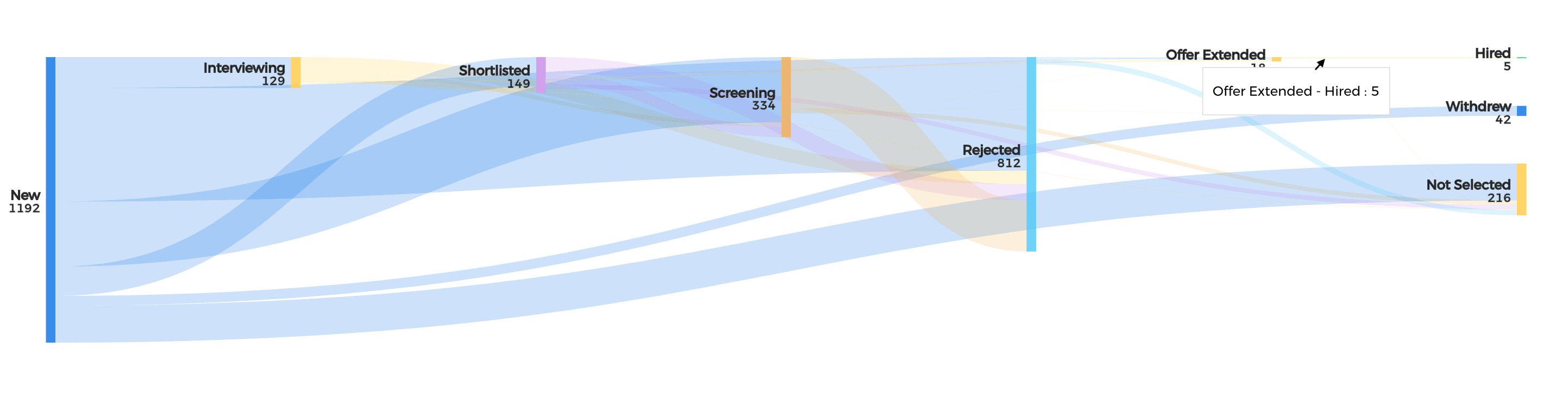
Sankey diagrams represent data flows and volumes between stages with proportional arrows. This allows for a clear visualisation of the volume of candidates moving through the pipeline and highlights where candidates are most likely to drop off or transition between stages. Unlike the traditional funnel view, which simplifies these transitions into a linear path, Sankey diagrams provide a more granular view of candidate movement and retention.
As we know, recruitment is not always a linear process. Candidates may move between stages, and the Sankey Diagram captures this dynamic flow. This helps in identifying bottlenecks and optimising each stage for better efficiency.
It is exactly these benefits that led our client to gain a deeper understanding of what was broken with their pipeline. By being able to see all drop off points along the candidate journey and understanding which stages were causing the higher proportion of rejections, he quickly identified the issue at the shortlisting step.
The problem wasn’t obvious, as superficially there hadn’t been any recent changes in the team. However, this increased rejection rate occurred during a period of significant team annual leave and many new people were standing in for the large numbers who were on holiday. This meant that the stand-in team members were not following the established protocols and were screening candidates according to the much simpler usage of credentials instead of focusing on diversity and skills.
This immediately helped pinpoint the problem and the team members filling in were trained in the proper protocols, which led to a significant reduction in the rejection rates. Not quite normal but no longer a red flag for management.
In this case, we can see that Sankey diagrams are better because recruitment pipelines often involve multiple stages and factors influencing candidate decisions. These visualisation tools can capture the complexity of these processes by showing not only the quantity of candidates at each stage but also how they transition between various stages, including reapplicants or candidates moving between different job openings. This level of detail supports a more comprehensive analysis of the recruitment process and can help root cause analyses for broken processes.
Where to from here?
We’ve only touched the surface of the power of Sankey diagrams. By combining them with candidate sources and channels such as job boards and LinkedIn or marketing channels (think programmatic marketing campaigns) we can not only identify where in the recruitment process candidates are dropping off but slice that by the respective channels. This is incredibly powerful stuff that any decent sized recruitment team must have.
This article makes clear that Sankey diagrams provide a visual representation that can be more intuitive for stakeholders to understand. The clear depiction of candidate flows and stage transitions facilitates better communication within the HR team and with other departments. This enhanced clarity aids in making more informed decisions regarding recruitment strategies and process improvements and can lead to advanced applications by combining marketing with the recruitment function.


The Hidden Flaw in Your Hiring
How an AI CV Assessment Tool Revealed the Real Challenges of Finding Top Talent It happens too often: months of carefully crafting the job description, advertising the role, then interviewing...
Read More
Driving higher candidate quality with better job descriptions
Smarter ways to find better talent Over almost a decade, the world’s largest enterprises have trusted Ubidy’s recruitment agency marketplace to fill the most difficult roles and every time we...
Read More